
DMG: Streamlining the Frontline Technician Experience
Role
Product Designer
The Focus: Information architecture, mobile utility, and reducing friction in high stakes onsite workflows.
Business Outcomes: 90% Success Rate
The impact of these design changes was immediate and measurable. By focusing on the human experience rather than just the technical plumbing, we significantly improved the company's operational efficiency.
30% Boost in Check-ins: Our redesign led to a 30% increase in technician check-on rates shortly after launch.
90% Overall Success: We reached an impressive 90% check-in success rate, virtually eliminating the gap we identified at the start of the year.
Productivity Gains: By reducing the click count and clarifying the search function, we saved technicians valuable time onsite, leading to higher overall productivity and less frustration.
Problem & Goal: Solving the Check-in Crisis
In mid 2024, we discovered a significant operational gap: 40% of technicians were failing to "check in" to jobs they had already accepted. Initially, the team assumed this was a technical issue caused by poor cell service at remote job sites. However, after a deep dive into the app, I realized the problem was actually rooted in a confusing and inefficient user interface.
The Challenge: The primary "Check In" call to action was hidden, and the job tiles were too cluttered for a technician to scan while on the move.
The Goal: Simplify the "My Jobs" layout and reduce the click count required to start a job, making the onsite process feel effortless.
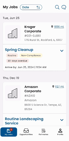
Old Layout


Search Bar Confusion
Collaboration: Pivoting the Project Scope
Strategic Alignment: I worked closely with product managers to pivot the project scope from "offline mode" development to a complete overhaul of the job information hierarchy.
Engineer Partnership: I collaborated with the development team to ensure the new "One Click Search" and pre-populated fields were technically feasible without slowing down the app's performance.
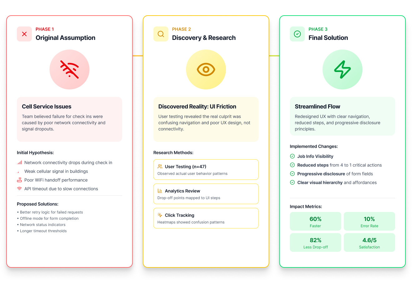
Research & Ideation: Technicians Crave Simplicity
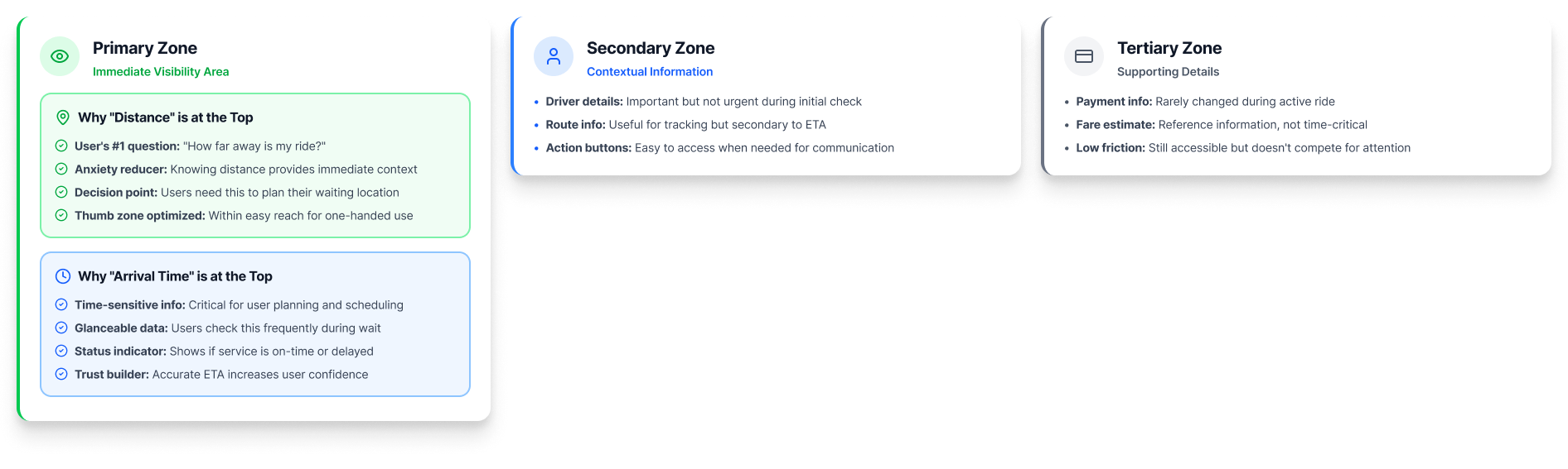
My research revealed that technicians are often managing multiple variables: arrival times, customer names, and specific job types: all while arriving at a new location. They don't have time to hunt for information or click through multiple screens.
Information Hierarchy: I redefined the "My Jobs" tile to prioritize the most essential data points: Job Type, Distance, Location, Arrival Time, and Status.
The Power of One Click: We moved away from complex search queries. I designed a pre-populated search bar that allows technicians to find their specific job with a single tap.
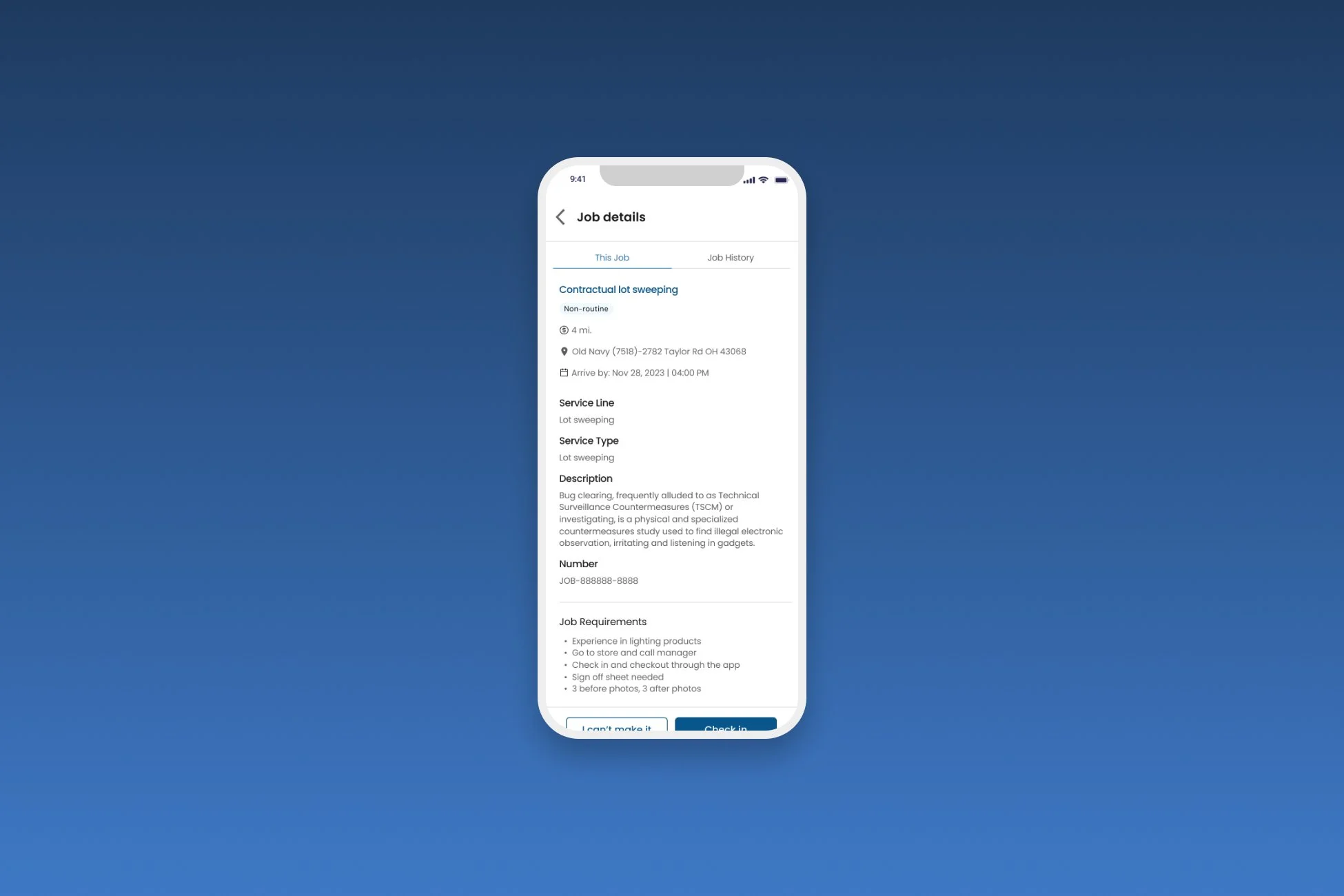
Final Design Overview
Technician's home base. I stripped away the visual noise and used contrast elements to ensure the status of each job is clear at a glance.
Technicians can now access full job details with a single click on a tile. The check-in button is no longer buried: it is the primary focus of the page once they confirm they are ready to start.
To solve the search bar confusion, I implemented a one-click search feature. This screen shows how the app anticipates the technician's needs by offering pre-populated job details based on their current schedule.


